In the rapidly evolving landscape of digital commerce, responsive market browsing has emerged as a cornerstone of effective user engagement and satisfaction. Consumers today expect seamless experiences that adapt intuitively to their needs, whether they are exploring products on a desktop, tablet, or mobile device. This expectation extends beyond mere visual adaptation; it encompasses performance, accessibility, and the nuanced ways users interact with marketplaces. A responsive market browsing experience involves understanding these interactions and designing systems that anticipate and react to them in real time, creating an environment where exploration is effortless and decision-making is supported by clear, immediate feedback.
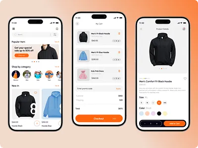
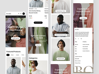
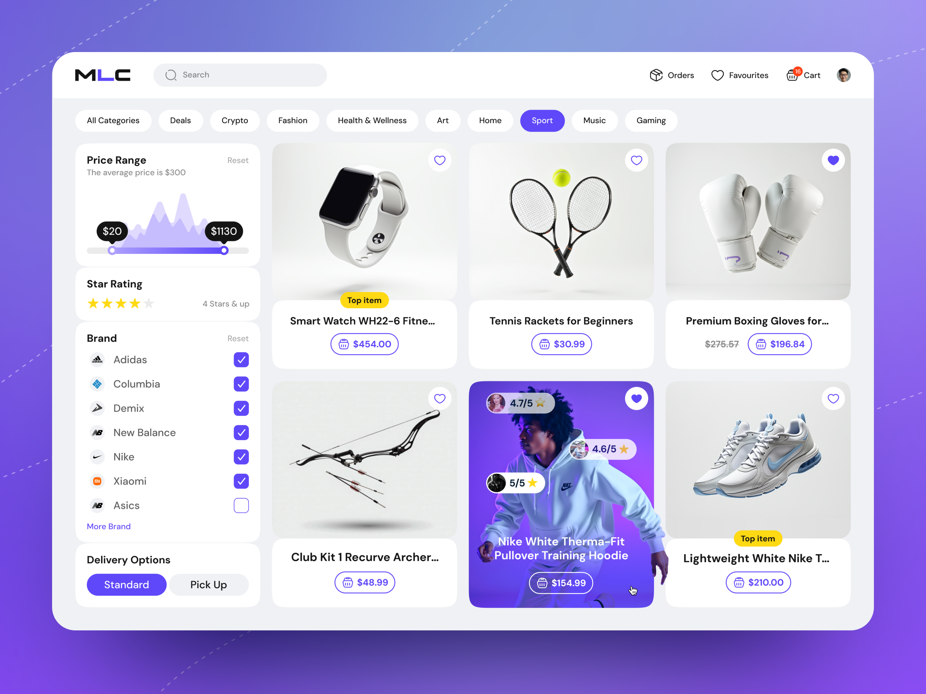
At the foundation of responsive browsing is the concept of fluid layouts. Unlike static interfaces, which maintain rigid structures regardless of screen size, fluid layouts shift dynamically to accommodate the device being used. This ensures that key information remains visible and readable, reducing cognitive load and minimizing frustration. For instance, a grid of products might display four columns on a desktop screen, condense to two on a tablet, and collapse into a single column on a mobile device. Beyond structural adjustments, typography, imagery, and interactive elements must scale appropriately. Font sizes and button dimensions should adjust to ensure legibility and usability without overwhelming the user interface or sacrificing aesthetic appeal.
Performance optimization is another critical aspect. Users are less tolerant of delays than ever before, and even minor latency can lead to abandonment. Techniques such as lazy loading, where images and content are loaded only when they enter the viewport, and asynchronous data fetching can dramatically improve perceived speed. Caching frequently accessed data locally and optimizing server responses ensures that browsing remains smooth even under heavy traffic conditions. Moreover, responsive market browsing is not limited to visual and speed adjustments; it also includes adaptive content prioritization. The system should intelligently highlight relevant products based on user behavior, search history, or regional trends, providing a sense of personalization without compromising the browsing experience.
Interactivity plays a pivotal role in keeping users engaged. Hover effects, quick previews, and gesture-based navigation can enrich the browsing experience by offering more information with minimal effort. For mobile devices, touch gestures such as swiping, pinching, and tapping must be considered in both layout and functionality. Navigation menus should be collapsible yet easily accessible, and filters must remain intuitive and responsive, allowing users to narrow down choices efficiently. Microinteractions, small animations triggered by user actions, can communicate system responses and provide reassurance, enhancing the sense of responsiveness and control.
Accessibility is an integral component that often intersects with responsive design. Ensuring that market browsing is usable by individuals with diverse abilities requires careful attention to contrast, keyboard navigation, screen reader support, and alternative text for images. A truly responsive market adapts not only to device specifications but also to user-specific accessibility needs. Features like voice search, scalable text, and customizable interface themes further enhance inclusivity, broadening the potential audience and reinforcing a commitment to equitable user experiences.
Data-driven insights are indispensable in refining responsive browsing. Analytics can reveal patterns such as which devices are most commonly used, how long users engage with different product categories, and where drop-offs occur. This information informs iterative design improvements, ensuring that responsiveness is not merely a technical attribute but a strategic approach to meeting user expectations. Heatmaps, click-tracking, and session recordings can further illuminate user behavior, allowing designers to fine-tune layouts, navigation, and content presentation to maximize engagement and conversion.
Cross-platform consistency is a subtle yet essential factor. Users often switch between devices during a single shopping journey, and a seamless experience requires that state, preferences, and context carry over effortlessly. Maintaining session continuity, synchronized shopping carts, and consistent filtering options creates a coherent narrative across platforms. This cohesion not only reduces frustration but also strengthens brand trust, signaling that the marketplace values user time and attention across all touchpoints.
Security and privacy considerations are intertwined with responsiveness. Users need confidence that their interactions are safe, especially when entering personal or financial information. Implementing secure connections, clear privacy policies, and transparent handling of user data reinforces trust and complements a responsive experience by reducing cognitive friction. Users who feel secure are more likely to explore freely, compare options, and complete purchases without hesitation.
Finally, the emotional impact of responsive market browsing should not be underestimated. The combination of speed, clarity, personalization, and ease of navigation creates a sense of control and satisfaction. When users feel empowered to explore without barriers, they are more likely to engage deeply, return frequently, and advocate for the platform. Every responsive adjustment, from a subtle animation to a fully adaptive layout, contributes to this perception, making responsiveness a multifaceted tool that shapes both user behavior and brand perception.
In essence, responsive market browsing is far more than a technical specification; it is a philosophy of design and user engagement. It requires a holistic approach that considers layout, performance, interactivity, accessibility, data-driven adaptation, cross-platform continuity, security, and emotional resonance. By integrating these elements, digital marketplaces can create experiences that not only meet but anticipate user needs, ensuring that browsing remains intuitive, satisfying, and efficient across all devices and contexts. This dynamic adaptability is the hallmark of modern commerce, where responsiveness is synonymous with relevance, trust, and enduring engagement.


Be First to Comment